Everything You Need to Know About Saturated Colors, the New Year's Trend
 Stockernumber2 / Getty Images
If you've been following our reporting on 2018 interior design trends, you know that stark, minimalist spaces are a thing of the past. We've been seeing more and more saturated colors recently — and, boy, do they look good!
One thing's for sure, though — when you're dealing with bold hues, you need a deft hand. So, if you're thinking of jumping on the bandwagon, let us guide the way. Below is a list of some of the most common applications for how to use saturated colors in your interiors and tips on how to pull them off like a pro. Trust us, you won't want to miss out on this one.
Stockernumber2 / Getty Images
If you've been following our reporting on 2018 interior design trends, you know that stark, minimalist spaces are a thing of the past. We've been seeing more and more saturated colors recently — and, boy, do they look good!
One thing's for sure, though — when you're dealing with bold hues, you need a deft hand. So, if you're thinking of jumping on the bandwagon, let us guide the way. Below is a list of some of the most common applications for how to use saturated colors in your interiors and tips on how to pull them off like a pro. Trust us, you won't want to miss out on this one.
 piovesempre / Getty Images
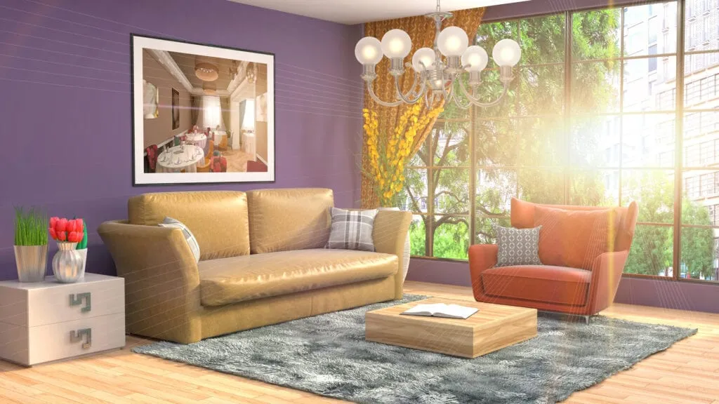
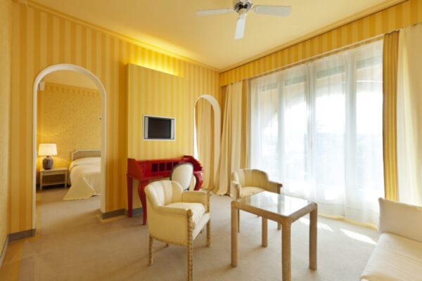
Tackling the walls
When thinking about adding color to a room, the obvious choice for many is to look to the walls. In the scheme of things, color is cheap. You can buy paint for pennies on the dollar compared to most design elements, and it will have a huge impact on the overall look of the room. However, before covering all four walls in the bold hue of your choice, consider the following: Is the room the right size to stand up to such a strong color? Since saturated colors are so bold, they need a room that's large enough that added color won't make it feel closed in, but small enough that the visual impact won't be too overwhelming. Usually dining rooms, office spaces, and formal living areas fit the bill nicely. If you're worried painting all four walls may not be the best idea, consider adding an accent wall. To do this, you'll just want to put your pop of color on one wall — ideally, the one that catches your eye when you enter the room — and then paint your other walls a lighter, more neutral shade.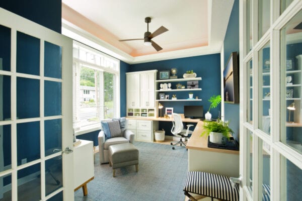 YinYang / Getty Images
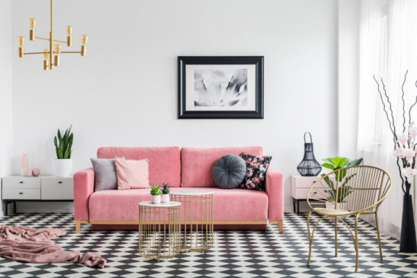
Incorporating furniture
For those who want to think beyond the walls, adding a piece of color-forward, statement furniture is always a solid choice. Remember, if you choose to go this route, you'll want this piece of furniture to be the first thing that catches viewer's eyes, so it should stand out. It's also crucial to make sure that your design elements stand out in a good way. Here are a few tips to keep in mind:- Placement: Statement furniture works best in a grouping, and should visually play off of contrasting pieces. For this reason, composed seating areas often work best, but a statement dresser in a bedroom or dining table would also suffice.
- Color: Whichever saturated color you choose, you should still make sure that it mixes well with the other colors in the room. Neutrals or opposite colors on the color wheel often match best.
- Size: A statement piece of furniture needs to be sizable enough that it can carry a room and command attention. Make sure that it is in scale with, or larger than, the rest of the pieces in the room.
 KatarzynaBialasiewicz / Getty Images
All about the accessories
Let's face it: Furniture can get expensive and paint, though affordable, does take some effort to redo if you're unhappy with the results. What if you want to take a subtle, noncommittal approach to the saturated color trend? Then it's all about the accessories. As always, accessories are the small details that really drive the room's aesthetic. They are throw pillows, area rugs, blankets, bedding, décor pieces and plants that round out your space and make it look intentionally designed, rather than purely functional. Plus, these items have a relatively low price point, so they can often be switched out much more easily than other design elements. Our advice is not to limit yourself too much by only searching for solid color accessories in the hue of your choice. Mixing and matching patterns is often one of the best ways to make accessories pop and, even if your chosen hue is only one of the colors in a particular pattern, it can still make a strong impact.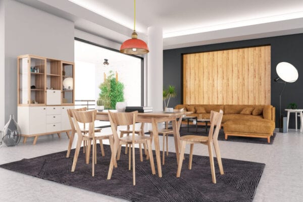 asbe / Getty Images