Top 5 Color Mistakes That Everyone Makes And How to Fix Them
You’ve decided to bring some new color into your home with a fresh coat of paint. Good on you! But Before you begin painting or buying any new furniture, take a look at a few of the most common color mistakes people tend to make.
1. Not considering light
onzon/ Getty ImagesLighting has a huge impact on the way a color looks and feels in a room. If you don’t consider how a room’s lighting looks with a color that you picked, there’s a good chance that you could end up living with a very different color shade than you originally intended. This mistake can be easily avoided with a little prep work.Before you choose a paint color, find a few different color samples that you like, and place them in various corners of the room. Watch how the light affects the samples throughout the day. You may notice that the sample colors turn out to be lighter or darker than what you want for that room. At this point, it’s much easier to just switch out your sample colors for other options than to redo the whole room from scratch.
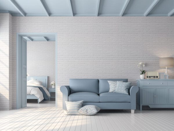
2. Forgetting about balance
Artjafara / Getty ImagesWhen dealing with multiple colors in a room, finding the proper balance between them is key. There’s a place for bold colors to stand out and there’s also a place for neutral colors to provide an opportunity for the eyes to rest. If you have too much of either one, you run the risk of the room becoming either too overstimulating or too dull. You just need to find that happy middle ground.Luckily, there’s an easy trick to help you out. Say hello to the 10/30/60 rule. This rule dictates what percentage of the room should be taken up by each shade in your color scheme. The first 60% is your base color and is usually a neutral shade. The next 30% is your secondary color (also known as that happy middle ground), and the final 10% is your accent color, which is your bolder shade.
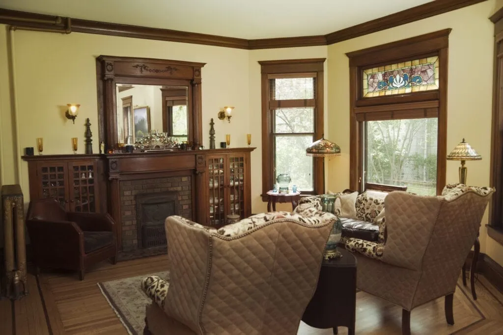
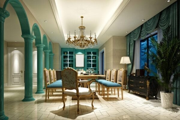
3. Designing each room separately
cr8tivguy / Getty ImagesAt first, it may seem to make sense to treat each room in your home as its own separate entity. After all, each room has its own individual uses, right? Turns out, it’s actually a much better idea to think of your home – or at least each level – as one cohesive unit and design your home with unity in mind.If you’ve ever wondered why model homes and professionally-designed spaces always seem so put together, it’s because of cohesion. Every room in those spaces shares a similar color palette. As a result, they all flow together seamlessly.Try to do the same thing in your own home. Start by establishing a sort of color harmony between adjacent rooms. When you’re ready to take things to the next level, consider going for one cohesive look throughout the entire space.
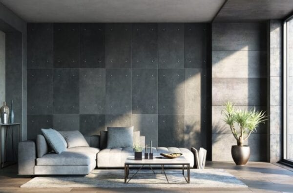
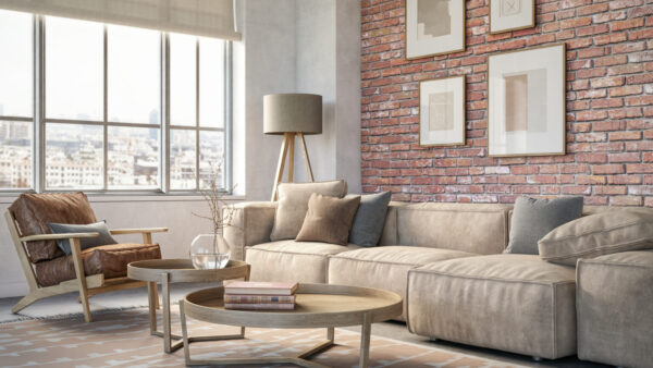
4. Leaving out contrast
Explora_2005 / Getty ImagesThe right amount of color contrast in a room can help certain room features stand out more, especially the little things. When you have too little contrast, you run the risk of the room becoming too dull and matching. Colors that are too similar to one another start to become boring to the eye and none of the design elements really stand out. It’s not a big deal though - it’s an easy fix. Simply add a little contrast to give the room a little more visual interest. Try adding an eye-catching accent color through the room’s accessories or throw a bold print or pattern into the mix.
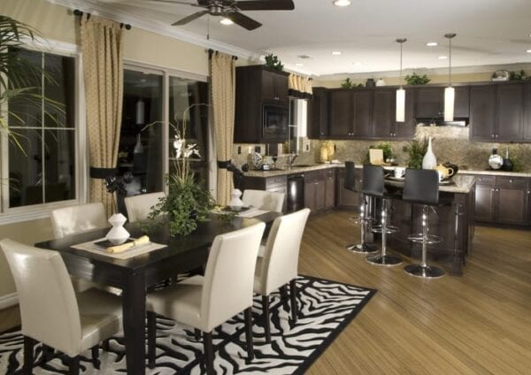
5. Not considering the feel of the room
CreativaStudio / GettyReading the room isn’t just exclusive to social situations. It’s important to know exactly how you want a room to feel before you start adding new paint or furniture. You’ll most likely be in or near that room on a daily basis, so be sure to choose colors that set the tone you want for that room.Take a moment to sit down in the room and think about what kind of vibe you want the room to give off. If it’s an entertaining room such as a living room or dining room, consider how you want a room to make your guests feel as well.
The bottom line
Now that you know the most common color mistakes, it’s time to get your creative juices flowing and start experimenting with some of your design concepts. Even though there are a few best color practices to follow regarding interior design, it’s ultimately your home, and you’re sure to make the best decision on what looks right for your rooms.
The products featured here are independently selected based on thorough research from our editorial team. If you buy something through links on our site, we may receive a commission.
Everyone loves gifts that they can get plenty of use out of, which makes practical gifts one of the best gifts to...
The products featured here are independently selected based on thorough research from our editorial team. If you buy something through links on our site, we may receive a commission.
A Christmas tree is the perfect centerpiece in any home’s Christmas decor. And there’s no denying the pleasant...
If you moved into a new home over the past year, you might be finding yourself on hosting duty for the first time this Thanksgiving, and that can be a lot of pressure. But don’t worry — a little bit of planning will go a long way towards a stress-free afternoon.
---
- Plan the menu
- Order...