What Is an Analogous Color Scheme? Your Design Secret Weapon

 Per Magnus Perrson / Getty Images
If you've been following recent design trends, you know that big, bold colors are soon to be everywhere. For fans of monochromatic looks, this news can be equal parts intriguing and overwhelming. After all, how do you even know where to start when it comes to using color in your design? We're here to help. One of the easiest ways to start using color is by incorporating an analogous color scheme. We'll explain what this color scheme is, why it works, and how to make it happen in your own interiors. Before you know it, you'll be bringing in color like a pro.
Per Magnus Perrson / Getty Images
If you've been following recent design trends, you know that big, bold colors are soon to be everywhere. For fans of monochromatic looks, this news can be equal parts intriguing and overwhelming. After all, how do you even know where to start when it comes to using color in your design? We're here to help. One of the easiest ways to start using color is by incorporating an analogous color scheme. We'll explain what this color scheme is, why it works, and how to make it happen in your own interiors. Before you know it, you'll be bringing in color like a pro.
What Is An Analogous Color Scheme?
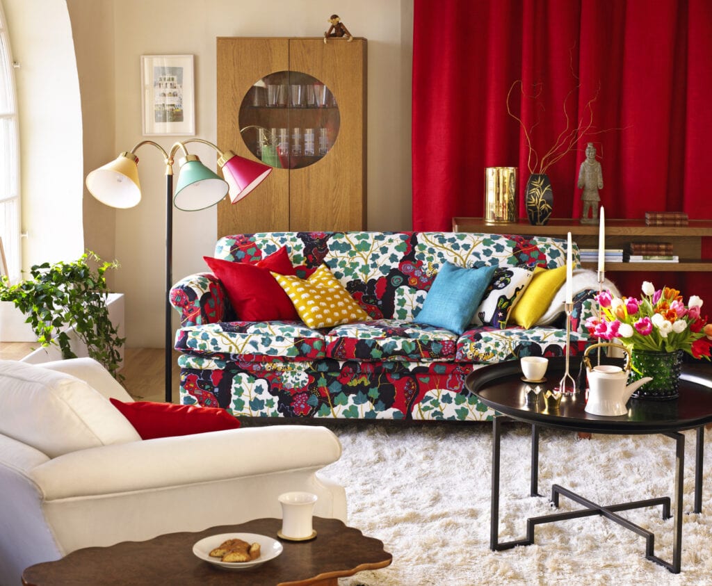
When you're putting together a room's color scheme, there are plenty of options to choose from. Color schemes can range from two shades to involving five distinct hues. However, the easiest - and most commonly used - schemes have at least three hues. An analogous color scheme involves three colors that are positioned next to each other on the color wheel. While neutrals can be added in as well, two of the shades involved will be a primary color (red, blue, and yellow, for those who need a refresher) and the third will be a mix of the two.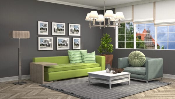 Stockernumber2 / Getty Images
Balancing Three Colors
Just as you would with any other scheme, when you're working with an analogous palette need to give each color a defined role in the space. This will create a sense of balance in the space and will keep anyone color from feeling too overwhelming. To do this, you'll use the 10-30-6o rule. As usual, you'll pick one color to serve as your dominant shade, taking up the bulk of your design. A secondary shade will play more of a supporting role and, finally, a third, more ostentatious color will act as an accent. If you're unsure how to make this decision, we recommend starting with a patterned item that contains all three shades. You'll be able to work out how frequently each one was used and construct the rest of your design accordingly. sl-f / Getty Images
Adding in Neutrals
Since working with bold colors has a tendency to overwhelm, we suggest adding some neutral shades to calm the space. There are two ways that you can go about doing this in your design. The first way is to add white, black, or gray into the colors themselves - in paint color, for example. In interior design terminology, these are known as tint, shade, and tone, respectively. They can be defined as follows:- Tint: The act of lightening a color by adding white to it.
- Shade: The act of darkening a color by adding black.
- Tone: Darkening a color slightly by adding gray
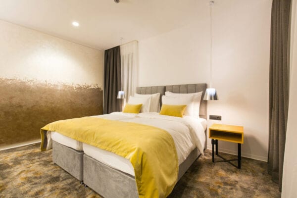 rilueda / Getty Images